GNOME and Unity - 2011 to 2023
 Technology’s rapid evolution is undeniable, and the transformation of the GNOME desktop environment from GNOME 2.0, to GNOME 3.0 (and the more recent GNOME 4.01 has been remarkable. Although I haven't used Linux as much lately, I vividly recall my experience with Ubuntu 16.10 and 17.04, which featured the Unity interface.
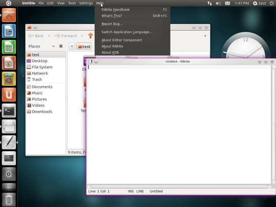
The development of Unity allowed Canonical to create new projects to extend the reach of Ubuntu beyond desktops and laptops to smartphones, tablets, and smart TVs.
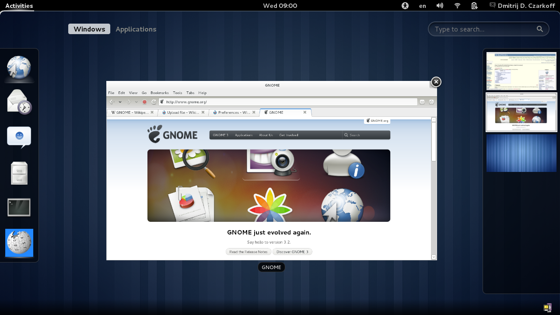
During this period, Canonical’s decision to develop Unity was done as an alternative to the GNOME Shell interface that was introduced in GNOME 3, both Unity and the GNOME Shell sparked waves of excitement and controversy within the Linux community. GNOME 3 had drastically departed from conventional desktop metaphors, presenting a more simplistic layout with an unobtrusive interface that had nothing beyond the thin panel at the top which include a clock, system controls, and the new Activities button - this replaced GNOME 2’s Windows-like interface.
 This transition was criticized by some in the Linux community, claiming it was less intuitive than anticipated, contradicting GNOME Shell’s intended purpose of enhanced usability.
The dissatisfaction with GNOME 3’s interface led to the emergence of alternative interfaces that were based on GNOME’s code - Cinnamon and Mate. Although the underlying technology between these desktops differ, they strived to replicate the beloved look and feel of GNOME 2. Mate was initially based off of GNOME 2 code, which became deprecated with GNOME 3’s release and the introduction of the GTK3 library and toolset.
As a result the developers of Mate initially forked the GNOME 2 codebase and toolkit (GTK2) for their project, however eventually the project adopted GTK3 as it was becoming difficult to continue development of GTK2 and by switching to GTK3 it would enable them to leverage the latest features and improvements. On the other hand, Cinnamon, developed by the Linux Mint team, utilized the GTK3 codebase from GNOME 3, to create their GNOME 2-like desktop environment. When I first used GNOME 3 in an early beta form, I was impressed with GNOME 3’s new interface, although I did encounter difficulties adjusting to the changes introduced with GNOME Shell.
There were some performance issues I recall encountering at the time due to GNOME 3’s reliance on 3D graphics2, particularly the Mutter OpenGL-powered system, raising concerns that older PCs and netbooks (which were gaining momentum at the time) with weaker Intel GMA graphics hardware, would encounter significant performance issues. To address this, GNOME developers and the Linux community optimized GNOME 3 and introduced a “fallback-mode,” offering a 2D-like experience for systems with limited graphics capabilities.
 Over the past decade, significant changes have occurred as the GNOME Project added extensions to their desktop environment, allowing users to further extend and modify the desktop, and have released their fourth major release as GNOME 40. In addition Canonical abandoned Unity and shifted focus back to the main GNOME project.
While I wasn’t particularly fond of Unity, I found some of Canonical’s projects that integrated Unity and Ubuntu to be captivating. For instance, Canonical’s Ubuntu Touch aimed to provide users with an alternative to Android, offering a more pure Linux experience, in addition users could attach peripherals like a keyboard, mouse, and screen to a smartphone which would then transform it into a conventional Ubuntu desktop environment3.
It’s unfortunate that Canonical was unable to succeed with these ambitious projects, however in retospect it was expected that they were facing an uphill battle as the smartphone industry had begun to coalesce around Android and iOS with competiting operating systems being unable to compete (WebOS, Windows Phone, Symbian, MeeGo, Bada, Firefox OS). It is disappointing that despite Ubuntu’s popularity as an operating system for servers, that Canonical was unable to secure partnerships with larger companies and were unable to secure funding for a Canonical branded Ubuntu Phone - the Ubuntu Edge, as part of a public crowdfunding effort4.
Canonical ended up collaborating with European firms like BQ and Fairphone to develop phones which would use Ubuntu Touch, however these partnerships would pose a challenge as BQ and Fairphone devices were not widely available for purchase or easily accessible outside of the European market at that time. Although I cannot confirm this, I would imagine that ordering a BQ or Fairphone Ubuntu Phone from outside Europe might have also require additional effort, such as dealing with international shipping and import duties, which would make Ubuntu Phones less appealing as these issues would contribute to an increased price for the phone, which would make it less appealing than competing devices from Samsung, LG, or Apple.
As a consequence of Canonical’s failures with these projects and continuing development costs to develop Unity, Canonical returned to using GNOME. By the time Canonical returned to using GNOME the interface had undergone further development and refinement with the addition of extensions5 that would allow users to modify their GNOME 3 desktop environment.
Here are some examples of GNOME extensions and what they can do to GNOME:
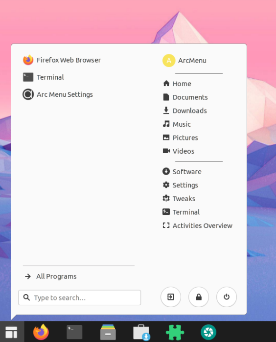
- Arc Menu: Adds a traditional, modern Start-menu like option to GNOME whose look can be customized
- Removable Drive Menu: Adds a status menu item next to the system controls in the top bar6 that allows users to quickly unmount removable drives
- Places Status Indicator: Adds a menu next to system controls that allows the user to quickly navigate to places on their system
- Caffeine: Adds a button to the top bar, next to system controls, that allows the user to enable or disable auto suspend
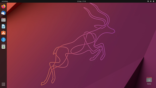
With the refinement that was now available to Canonical they could now easily replicate the Unity interface’s dock using GNOME extensions.
 The journey of GNOME and the influence of Unity exemplify the dynamic nature of technology and the continuous pursuit of innovation within the Linux ecosystem. As GNOME evolves with each release, the GNOME Project has continued to innovate and adapt. Canonical’s ambitious projects, including Ubuntu Touch and Ubuntu Edge, showcased the potential of Ubuntu in the mobile market but faced unfortunately met insurmountable obstacles which led to the failure of these projects.
Despite these setbacks, Canonical’s shift back to GNOME and the incorporation of extensions have allowed them to offer a more customizable and familiar experience to users. With the ability to replicate Unity’s dock using GNOME extensions, users can now enjoy the best of both worlds, combining the power of Ubuntu with the refined interface of GNOME Shell. The journey of GNOME and Ubuntu remains an exciting chapter in the ever-changing landscape of open-source technology.
-
The latest iteration of GNOME which expands on concepts and features introduced with GNOME 3.0. ↩︎
-
At that time, I was using graphics hardware that was considerably outdated. ↩︎
-
This ability to connect peripherals to a smartphone to convert it into a full desktop version of Ubuntu might have been limited to Canonical’s planned high-end Ubuntu Edge smartphone ↩︎
-
Canonical launched a crowdfunding initiative in 2013 to create Ubuntu Edge which was planned as a high-end smartphone to compete with the iPhone and Samsung’s top of the line devices. There was significant interest from the Ubuntu community and tech enthusiasts, however the crowdfunding failed to meets its intended funding goal - Canonical was unable to raise $12 million of the $32 million USD - which was the highest amount requested in a crowdfunding project at the time. ↩︎
-
Extensions were introduced with GNOME 3.2, released in September 2011 - a scant 5 months after GNOME 3 was released. ↩︎
-
The panel at the top of GNOME Shell is commonly referred to as the “top bar”. ↩︎